

Korean typography, or what a modern designer can take from Asian creativity
We often focus on Western benchmarks in design (and not only), forgetting about the rich Eastern experience in this area, known for its aesthetics. This is what the speakers' reports called "Oriental Creative" was dedicated to at Cannes Lions last year.
As Cannes Lions is one of the sources of insights and trends for the creative industry around the world, Maryna Roda, designer of the marketing agency Brain Tank, offers in her article to meet a bright representative of oriental creativity, the founder of Korean typography, designer Ahn Sang-soo.
Father of Korean typography Ahn Sang-soo
Ahn Sang-soo is one of the most active Korean designers in the global design community. Korean typography in its modern form owes much to him. Ahn Sang-soo's contribution and design achievements took numerous awards, including Design Magazine's Designer of the Year in 1983, ZGRAF 8's Grand Prix in 1998, and the 2007 Gutenberg Prize.
The main legacy of Ahn Sang-soo is the revolution of the Korean alphabet, Hangul. Hangul is believed to be the simplest writing system in the world and can be studied in a matter of hours. It consists of 14 consonants and 10 vowel sounds. It was created as a unique alphabet for spoken language in the middle of the XV century. Hangul represents a departure from Chinese traditions and the formation of a culture of independent Korea.
Ahn Sang-soo was the first to use the graphic flexibility of hangul. He changed its square structure. Ahn Sang-soo's unconventional vision is reminiscent of the work of Jan Tschichold, a famous European typographer, and his manifesto of German typography, Die Neue Typography, 1928, which had a great influence and became a window into European design.
Fonts of Ahn Sang-soo
The designer began to study the readability of the Korean font in newspapers and earned the Korea Newspaper Award for that. It eventually led to the first development of his own font design in 1985. The Ahn Sang-soo font demonstrates the first type of hangul that pays attention to variable width. That same year, he founded Ahn Graphics, his own design firm, and publishing house. Now the designer has created four outstanding fonts for hangul.
The combination of fonts, photos, illustrations, patterns of Ahn Sang-soo even now looks relevant. Prior to that, Korean masters had traditional methods of expression, but Ahn Sang-soo's experiments in creating new fonts gave impetus to the development of Korean design in general.
Ahn Sang-soo's work is distinguished by its ability to highlight and emphasize elementality. This is perfectly illustrated in the projects "Once.upon.a.time.", "Words.were.stars.", "When.they.took.on.a.meaning.", "They.fell.to.earth." Short and bold images in content and form are an example of the designer's philosophy. At the same time, his design remains as practical as it is aesthetic.

Trends
Recently, among other trends in design, there is a trend towards minimalism and simplification, and the Korean typography and work of Ahn Sang-soo perfectly translates this simplicity.
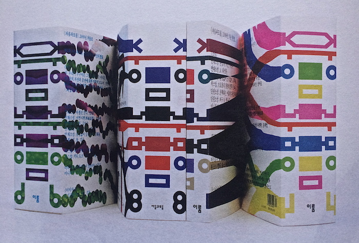
Korean design is well balanced, clear, simple. Here they are not afraid to place the image of the product in the center, leaving around a lot of air, space, which is beautifully divided into blocks, taking into account the hierarchy of information. Then supplement it with a small logo, a concise description. Or, conversely, successfully beat the space, paying more attention to the image of the product.
Gradually, the influence and style of oriental design became noticeable in the European design environment, where there is a space for experimentation. Small young companies do it most boldly and successfully. They begin to use in their style playful elements, simple bar fonts without serifs, simplify the design.
Of course, the design and fonts, like everything else, match the pace of time. If earlier it was normal not to hurry to read one word, now you need to grasp quickly the essence and move on. After all, a lot of information must be quickly perceived and filtered.
Therefore, a poorly chosen design or inappropriate font does not fulfill its function — to convey information. Visually unsuccessful advertising causes aesthetic at once and a feeling of inappropriateness, perhaps even cheapness.
So here we have something to learn from the Korean design and typography and creativity of Ahn Sang-soo. In Korean cases with typography, the influence of simplification tendencies on modern design is perfectly traced.
In general, by studying the cases of Korean typography, you can look into another design environment, look at how they work with typography in Asia, get inspired by new methods of working with the font and try to adapt this experience to our typography.
Useful links:
- A clear example of the design of the hangul in the book
- About the creativity of Ahn Sang-soo
- References to works and other information were taken from the sources: 1, 2, 3
- A large selection of works by Korean designers
- Examples of modern projects with Korean fonts: 1, 2, 3, 4
Photo: behance, pinterest, designobserver.com.