Time to change the rules. And brand codes.
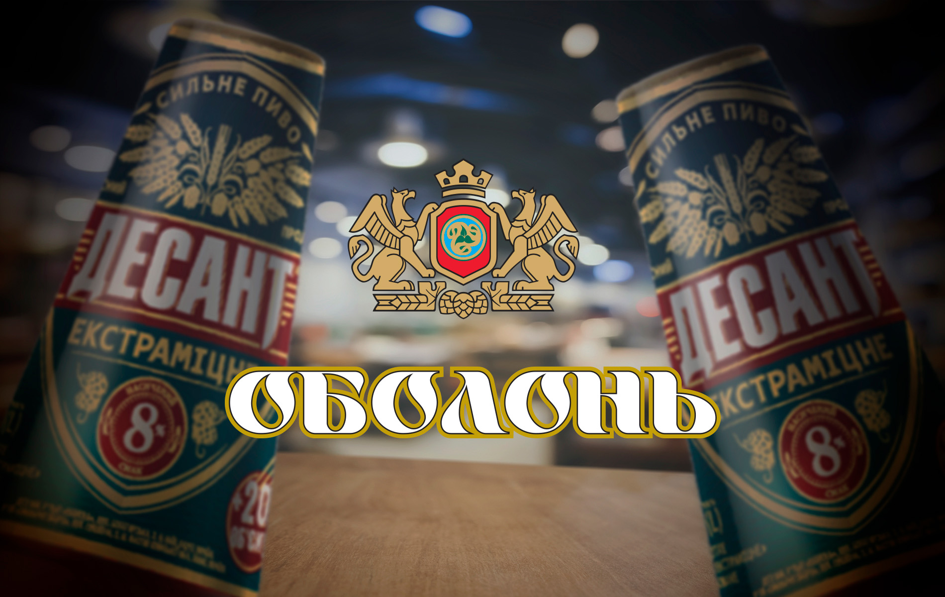
We talk about changing visual codes and looking at the brand through the eyes of the modern consumer using our own case of redesigning the label for "Desant" beer.
What's happening in the FMCG market right now? The thing is following.
Today, in the context of limited media budgets, the shelf sells like never before. People come to the store, whether it's an online store or offline, and they choose with their eyes, reading the visual codes of the brands presented on the shelves.
But here's the nuance: although the visual codes haven't changed much, their significance has been reinterpreted, in some cases, quite radically. And the shifts that were previously considered selling now require adaptation to meet the current demands and expectations of consumers.
Let's look at our case of redesigning the labels of "Desant" beer, a brand of the Ukrainian company "Obolon." This case is about how a brand can change without losing its loyal audience, which is resistant to radical changes.
The Issues:
The results of consumer perception research regarding the design of "Desant" TM revealed the three biggest pain points of the brand:
~ the codes of the Ukrainian "paratroopers" do not intersect with the codes on the label, so the design is described as Soviet or even Russian.
~ the emphasis on military styling is at odds with the image of the Ukrainian military, which should be sober.
~ overall, the audience perceives the label as outdated and, at the same time, is not ready for noticeable changes in the design and complete removal of its militaristic color.
In other words, the brand needs to completely update the design without changing it.
What to do?
The Solution:
We all look for familiar products on the shelf based on a familiar color pattern, in other words, a pattern of spots with an approximate image of the logo. And when a brand wants to refresh the label without losing recognition, this set of spots becomes the basis of the design. The most interesting thing is that this is no less complex and exciting work than creating a completely new label, as in the end, everything should look very simple, as if the brand has always looked like that.
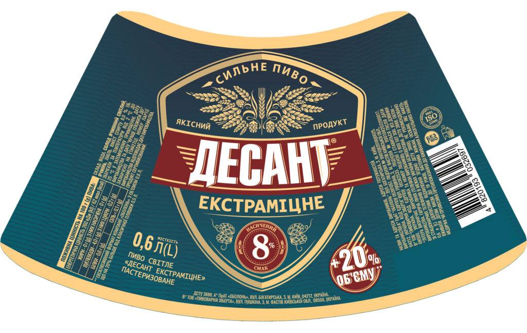
So, "Desant 2.0" in the new visual codes has invisibly changed for consumers:
~ the background palette and red logo tags.
~ the brand pattern.
~ fonts of technical information to a more modern style.
~ the beer strength marker is now a noticeable aesthetic symbol that consumers will find on the shelf.
~ the composition with a parachute on the product composition in the form of wings made of malt and hops with the imitation of a coat of arms in its heart.
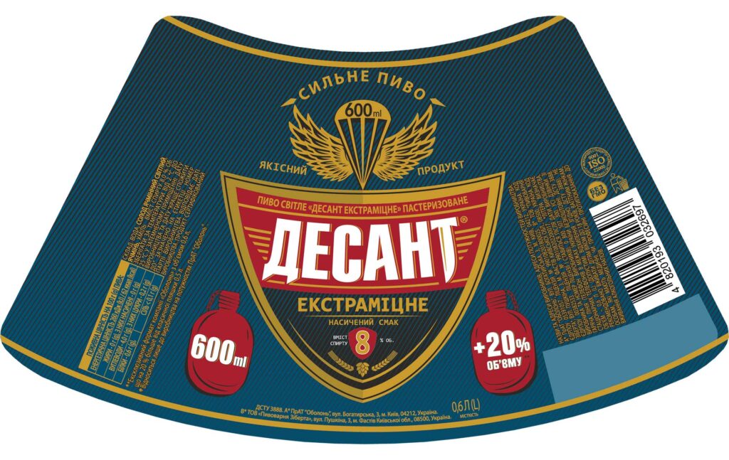
Let's compare it with the label of the smallest 0.6-liter format before the redesign:
Updated label:

Conclusion:
It is extremely important for a brand to update its visual codes. Even those consumers who do not notice visual changes in their favorite product will subconsciously feel that the brand speaks their language and shares the same values, which undoubtedly positively affects the health of the brand.