Foodpaysaging
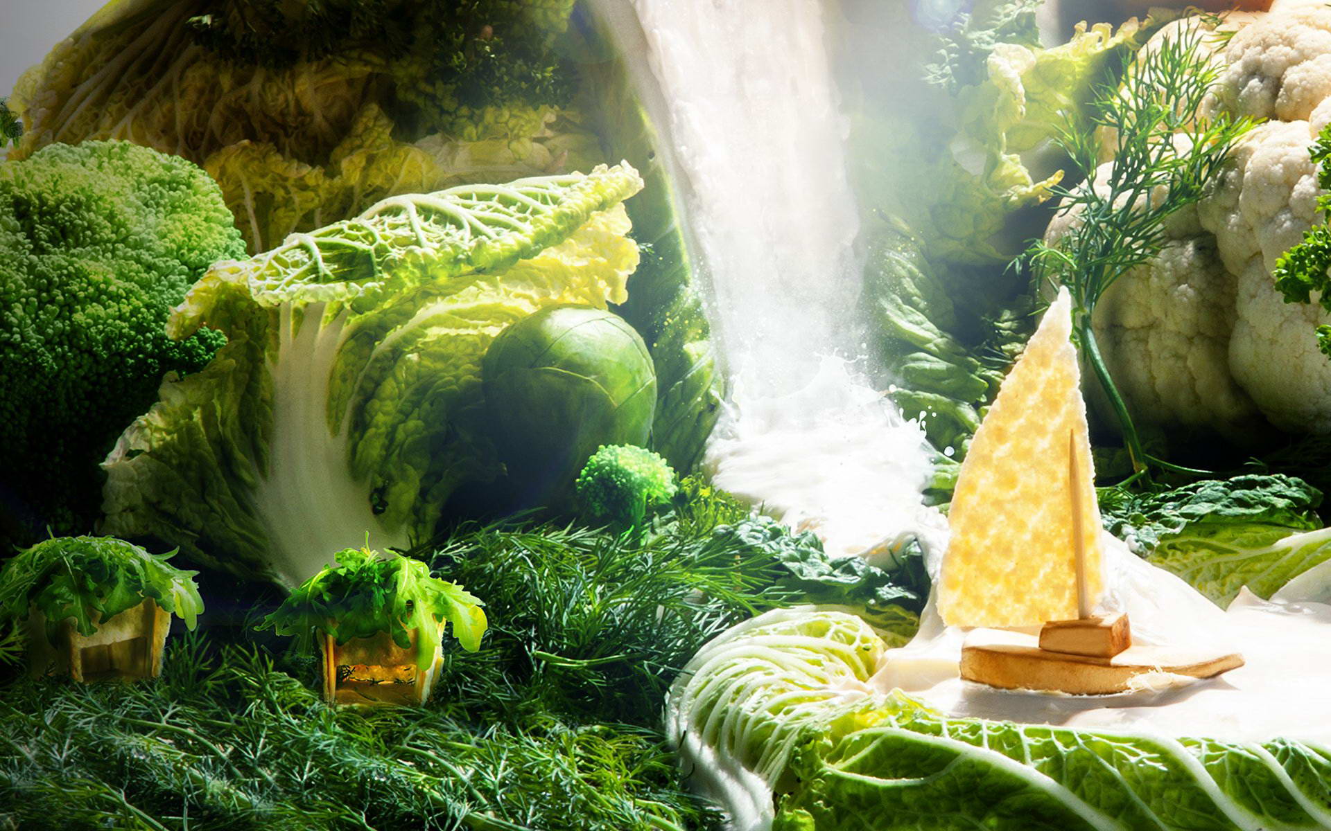
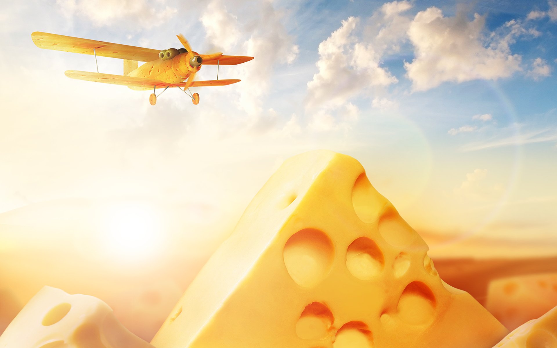
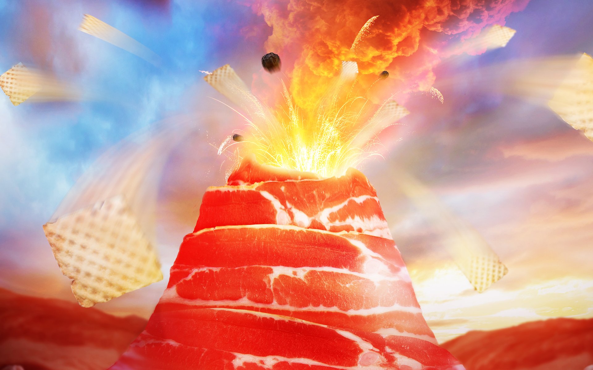
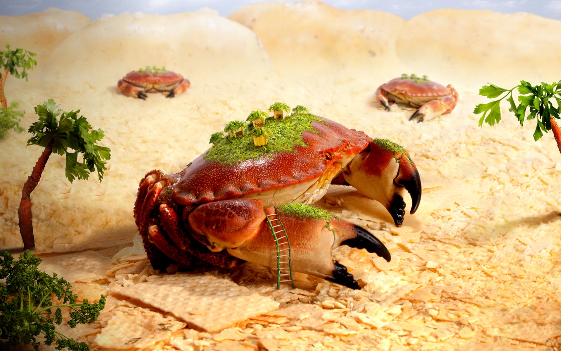
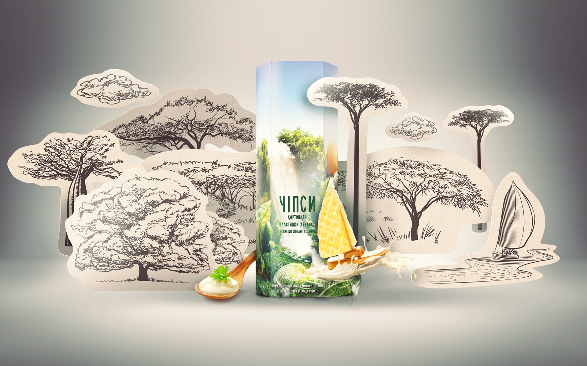
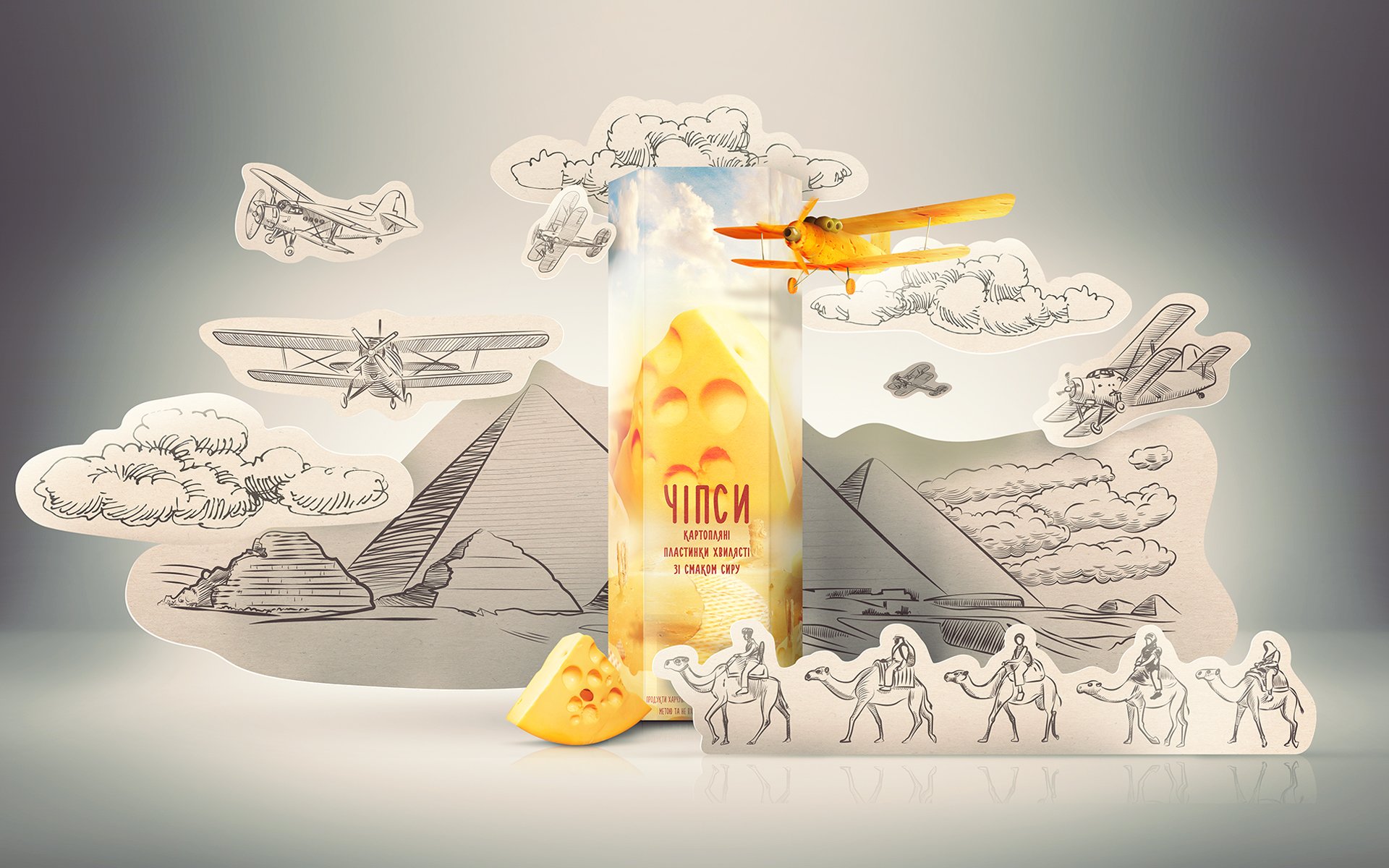
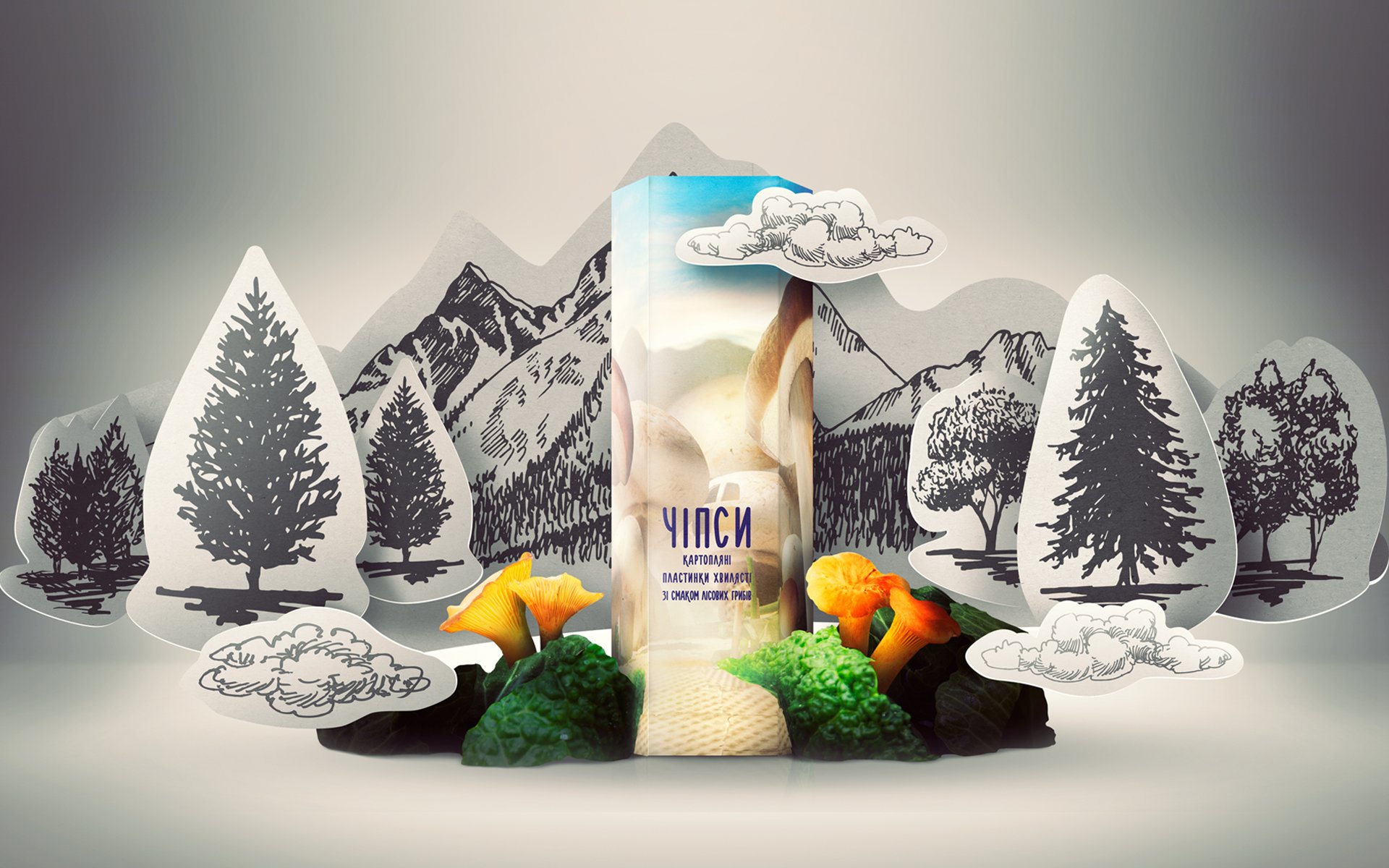
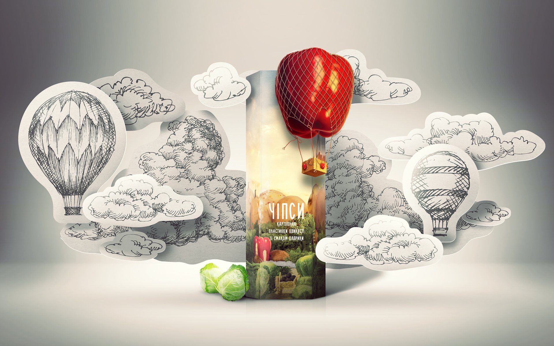
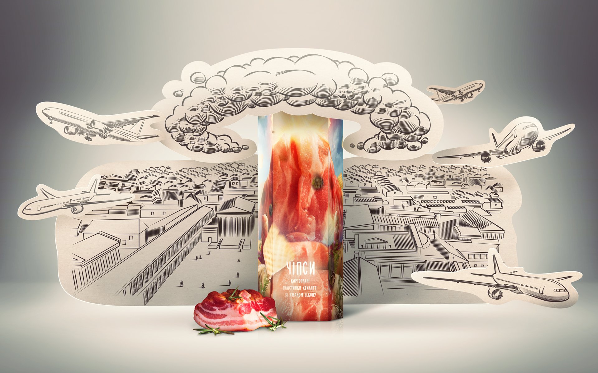
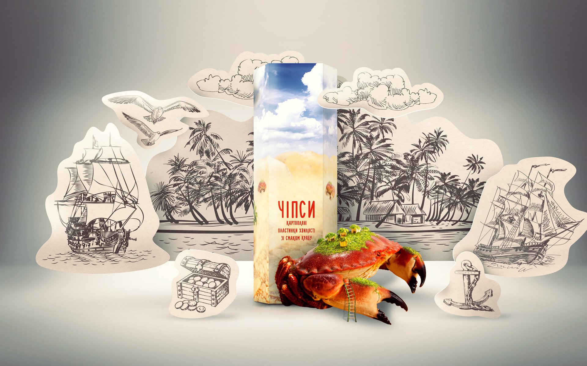
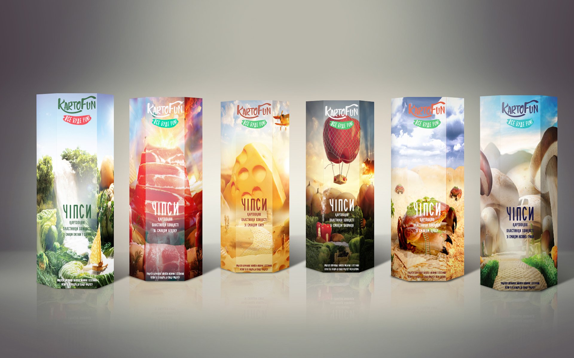
When you are coming somewhere, where you haven’t been waited for anyone, it’s need to show great ingenuity to be noticed. So for occupying by Kartofun chips its «place under the sun» on the shelf our agency completely rethink visual brand element, creating for it package design of six tastes in oldschool-crafted foodscapes manner.
Yesterday Kartofun left only brand name and dynamic slogan «All will be FUN!», which did not interrupt future changes. But gloomy 90ies package did not evoke trust, just like the composition base of the line.
Solution
Redemption from last remnants lasted in two stages.
Redemption from last remnants lasted in two stages. First Brain Tank worked on «inner world» of Kartofun package: uncomfortable tight foil package was replaced by corex. Also form of chips has changed – long rectangular wafers has become compact.
Than was the turn of creating of new visual identity of brand, during that many ideas were sent to trash. Agency searched for design, that responds to two non-simple requirements: it must foreground and be one and only.
The winner of hard casting became foodscapes style — technique of creation of products’ landscapes. That was it. To find some similar in the world is quite hard (maybe, without mentioning of this course’s evangelist — Carl Warner), and at the Ukrainian market – the same. Customer wants to take a package with such cover from the shop’s shelf and see it more closely.
But the main feature of rebranding have become stories on each package of Kartofun line. To fly by balloon, go to excursion to cheese pyramide, walking down the mushroom meadow – all depends on taste you like. Now everyone has such opportunity.

